10,000 search results
(0.056 seconds)
- Meche Pro by RodrigoTypo,
$29.00 Meche Pro it is a geometric typeface family with a semi-formal touch, it contains 12 variants, from the Thin to Black and Stencil Thin to Black versions, plus Cyrillic alphabet with alternatives and different ligatures was added, especially for titles
 - Merengue Script by Sudtipos,
$59.00 Merengue Script is the second typeface designed by Panco, once again together with Ale Paul, who supervised the whole development. In this opportunity, the process of shape research and the systematization of signs led him to dive into new waters. The objective was to generate a system of signs in which the construction of such was not directly bound to traditional calligraphy, nor to texts typography. Instead, the point was to create signs inspired in “Brush pen” calligraphy but with their main features drawn or literally illustrated. The result was a font with personality, authenticity and uncommon formal aspects that make Merengue Script an interesting, highly attractive and rather unusual font. From the very beginning, the search was based on creating a font with weight and good presence in big formats, but, at the same time, efficient for brief texts of small formats. The aim was to make it usable mainly in candy, sweets and chocolate packaging. The predominance of round shapes, harmonious modulations and funny and friendly-looking visual rhythms spark a special effect in the usage of Merengue Script. Texts are enhanced with an interesting visual charm, capable of transforming a very simple text into a virtual illustration that semantically reinforces the messages in a simple way, without putting legibility at risk. With a basic set of stylistic alternatives full of frills and flounces for initials, ornamental and final letters, plus a set of disconnected signs, Merengue Script offers a wide and versatile range of options for graphic designers in the process of packaging design.
 - HWT Aetna by Hamilton Wood Type Collection,
$24.95 HWT Aetna is a revival of the sturdy Roman style of wood type most often called simply Aetna. This new digital version by Aaron Bell features four widths all based on the various widths commonly offered by 19th Century wood type manufacturers. In addition, there is a four-layer all-caps version Aetna based on the the famous Wm. Page Chromatic Types, that allows the user the ability to easily create these chromatic streamer and shadow effects. Both the multiple width Aetnas and Streamer component fonts support full Western and Eastern European languages.
 - Kresson Black by BA Graphics,
$45.00A beautiful very bold serfi face, formal legible design, with matching Italic, Powerful yet elegant. - The Mainsthen by HKL Studio,
$19.00 The Mainsthen is a calligraphy script font that comes with exquisite character changes, a kind of classic copper decorative script with a modern twist, designed with high detail to bring out an elegant style. Antura script is interesting because it has a soft, clean, feminine, sensual, glamorous, simple and very easy to read typeface, because there are many fancy letter joints. I also offer a number of decent stylistic alternatives for multiple letters. Classic style is very suitable to be applied in various formal forms such as invitations, labels, restaurant menus, logos, fashion, make up, stationery, novels, magazines, books, greeting / wedding cards, packaging, labels or any type of advertising purposes. The Mainsthen is encoded with Unicode PUA, which allows full access to all additional characters without having any special design software. Mac users can use Font Book, and Windows users can use Character Map to view and copy any of the additional characters to paste into your favorite text editor / application.
 - Postulat by ParaType,
$30.00 Postulat is a contemporary slab serif typeface. The family contains 16 fonts: 8 romans with matching italics, from Hairline to Bold. The character set include contains more than 600 glyphs which support most Latin and Cyrillic languages. The font uses a combination of smooth and extremely simple straight shapes. The author abandoned the use of teardrop-shaped classical elements, replacing them with straight ones, which makes Postulat more dynamic and modern. These unique features give the font a unique personality. Postulat is the perfect choice for headlines, logos, branding, packaging, publications and websites.
 - Brifa by Twinletter,
$10.00 Introducing our newest font called Brifa. Fonts that have unique letters create a distinctive impression when applied to words or text. We designed this san serif family font by paying attention to the combination of each letter to create an elegant impression and appearance making it easier for you to use it according to what you need, both formal and non-formal needs. This font is perfect for a wide variety of design projects, sporting events, branding, banners, posters, movie titles, food and beverage, technology, quotes, clothing, logotypes, and more. Of course, your various design projects will be perfect and amazing if you use this font because this font comes with a font family, both for titles and subtitles and sentence text, start using our fonts for your amazing projects.
 - Kollate by Invasi Studio,
$19.00 Kollate - a display serif with a line, simple, clean, and visually elegant. Specially designed for elegant-themed projects, perfectly suitable for creating simple, clean, lifestyle designs such as logos, titles, magazines, and more. The font features standard ligatures.
 - The Acres by Set Sail Studios,
$20.00 Introducing The Acres Font Duo - A luxury Sans & Serif all-caps font duo. Take away the painstaking search for the perfect font pair, as these typographic partners were made for each other. The Acres Serif is a wide, high contrast serif font, designed with high-end looking branding in mind. The Acres Sans is a simple, elegant sans font, designed to compliment the serif font as secondary text. Accessing Ligatures & Extras • The Acres Serif Also contains 33 specially designed ligatures (double and triple letter combinations), to give you extra customisability. These Standard Ligatures should switch automatically when using OpenType capable software. The font is all-caps, however the ligatures will only switch when typing in capitals (i.e. turning off caps-lock gives you a quick way of turning off ligatures). There are also raised small-caps for A,E,I,O,U, these can be accessed by turning on 'Stylistic Alternates', and simply typing each letter in capitals. All special characters can also be manually inputted via a Glyphs panel. Language Support • Both fonts the following languages; English, French, Italian, Spanish, Portuguese, German, Swedish, Norwegian, Danish, Dutch, Finnish, Indonesian, Malay, Hungarian, Polish, Croatian, Turkish, Romanian, Czech, Latvian, Lithuanian, Slovak, Slovenian
 - PIXymbols Patchwork by Page Studio Graphics,
$25.00A collection of traditional American patchwork quilt motifs in a decorative font package. Over 80 designs, to be used as free-standing illustrations, in borders, or as an overall pattern. Several designs will work together into a pattern. - Amanet by Tour De Force,
$25.00 Amanet is original old fashion typeface that comes as Regular weight followed with stylistic compatibile Borders. It's pretty readable in small sizes which recommends it for use on packages, labels or specific corporate identities. "Amanet" is an archaic Serbian word for English word "legacy".
 - Lovers Pro by Scholtz Fonts,
$35.00 Lovers is a romantic, elegant handwritten calligraphic script, with well over 300 additional characters, including standard and discretionary ligatures, swashes and stylistic alternatives. Use of its extensive OpenType features enable the designer to create text that constantly changes, giving the impression of genuine handwriting, but handwriting that has all the flair and styling of hand-done calligraphy produced towards the end of the twentieth century. Lovers is based on traditional calligraphic ideals, but I've combined these with my own brand of relaxed, handwritten spontaneity, to design a font that is formal yet free and accidental, traditional yet contemporary. The font’s extravagant curves and swashes make it perfect for valentine’s day and wedding media, book covers, greeting cards, and certificates, in fact for any design work that requires a romantic or opulently elegant look. The range of stylistic alternatives and swashes enable users to create a wide range of moods in their work. In many ways it is a calligraphy toolkit. Lovers contains the accented characters used in the major European languages. What sets it apart from most other calligraphic fonts is that it appears so genuinely handwritten and avoids the uptight formality that characterizes so many of the fonts in this genre. Try Lovers, enjoy its wealth of OpenType features and let its vigorous yet elegant exuberance delight you and enhance your creativity!
 - LiebeTweet by LiebeFonts,
$19.90 LiebeTweet gives you countless variations of cute birds to reflect personality, style or mood. Every one of these nestlings is unique and special, such as the little chef, the singer in the rain, the bridal couple, the lifeguard and many more ... and of course, we did not forget to include the cuckoo clock and the owlet. Put these birdies on your website, your personal blog or your Facebook page. Or print them out on invitations and greeting cards. 90+ carefully crafted drawings are included in this single font and can be used in any text or graphics application. If you like this font, have a look at our other cute fonts such as LiebeFish and LiebeRobots.
 - Southern Belle by Angie Makes,
$12.00 Southern Belle, a cute little handdrawn font with a ton of character and a slow, southern drawl, was inspired by sweet tea and southern blossoms. Its uppercase letterforms would be a great fit for logos, envelope addresses, and more! This Southern Belle font features repeating borders, and a ton of cute little doodles. (try using + + +, = = = , and _ _ _ to see borders repeat). To access all of the characters in this font, we recommend using the glyphs panel in Adobe Illustrator. This font works best in open type aware software. Comes as an .otf font file. NOTE: To access all of the cute extras in this font that are not accessible from your keyboard, you will need software with open type glyph capabilities such as ADOBE ILLUSTRATOR or ADOBE INDESIGN.
 - Brandon Grotesque Condensed by HVD Fonts,
$40.00 Eight years after the initial release of Brandon Grotesque , the typeface has grown into a font family of 48 styles, including a version for small sizes and a space saving condensed version. This type family was completely drawn from scratch with the look and feel of the original normal-width version. Today, Brandon supports at least 116 languages, from Latin based languages to Greek and Cyrillic.
 - Acaraje by Latinotype,
$39.00 Acarajé is a grotesque font that stands out thanks to its versatility. Its personality blossoms through its particular modulation, which grows with weights; making it a rather jovial typeface that does not abandon the characteristics of more classic grotesques. With two styles available: normal and italic, and a variety of 7 weights that range from "Black" to "Regular", this font offers incredible flexibility for your designs.
 - Vast by ParaType,
$30.00 Vast is a variable sans serif with a range of styles from thin to black and from normal to extra wide. This versatile font family of both of a serious and friendly nature can be used for various purposes, such as text, logos, headings, and branding. Vast was designed by Manvel Shmavonyan with the assistance of Alexander Lubovenko and released by Paratype in 2021.
 - Lush Script by Positype,
$59.00 Lush was a formal script until it had a few too many drinks and, as a result, loosened up a little bit. Harkening back to the handlettering of the 40s and 50s, Lush has evolved into a casual, but well-dressed script that maintains a rather aggressive rhythm. Transitions often whip back quickly, forcing the letters to reel from the movement and resolve efficiently. It is not as warm as some scripts, intentionally so, so as to distinguish it from its predecessors. Type and lettering fans will revel in the options afforded to each character—in some cases there are up to 15 different variations with multiple glyph recipes available to produce the most unique and fluid lettering combinations possible. An often overlooked segment of contemporary script fonts, the uppercase letters have at least 3 options to work with that mesh well with the 36 ornamental flourishes to add even further embellishment. In total, there are over 1,650 glyphs in the typeface that includes these OpenType options: Stylistic Alternates, Contextual Alternates, Swashes, Titling, Historical Forms, Initial Forms, Oldstyle Numerals and 3 additional Stylistic Sets. With this release, I have tried to provide as much flexibility and 'forgiveness' within the typeface so the lettering enthusiast can have fun and explore thousands of iterations… and it's pretty easy math to figure this out: with over 970 alternates and 270 ligatures, I intended this typeface to be one that keeps on giving. One important fact to note… this marks the first release of a smooth, non-brushed, non-textured script from me—but it won't be the last. That said, I will have to admit that the brush has influenced many of the characters and their construction. Enjoy :)
 - Reverse Vintage by Din Studio,
$29.00 Choosing fonts for design projects can be an endless task to do because there’s thousands of fonts out there all that you could use. Wait no more, we will give you the best choice. Reverse Vintage-A Display Font The Reverse Vintage aims to bring out a modern and stylish view. This font is made specifically designed to fit a variety of different content needs and projects. Everything’s well with cursive! The curvature of the Reverse Vintage was fully thought out to easily meld inside your designs. These fonts make a good foundation of what you want it to be. Show your opulence and decadence with this fancy font and blow your audience’s mind away as you put these cursive letters in your projects. Reverse Vintage includes Multilingual Support to make your branding reach a global audience. Features: Ligature Stylistic Alternates Swashes PUA Encoded Numerals and Punctuation Thank you for downloading premium fonts from Din Studio
 - Authemart by Great Studio,
$17.00 Introducing a new quality calligraphy font is Authemart Script. High-quality script fonts come with modern and vintage touches in them. Inspired by a mixture of copper calligraphy with handlettering style. OpenType feature with Stylistic Alternatives, Swash, Ligatures, Stylistic sets. It allows you to mix and match letter pairs to fit your design, and also comes with modern ornaments to make this font look elegant and perfect. Authemart is attractive like a smooth, clean, feminine, sensual, glamorous, simple and very easy to read. The classic style is perfect to be applied in various formal forms such as invitations, labels, menus, logos, fashion, make up, stationery, letterpress, romantic novels, books, greeting / wedding cards, packaging, labels, and more. Authemart also supports in pragram, Adobe Illustrator, Adobe Photoshop, Adobe InDesign, Corel Draw X version, Microsoft Word, Language Support : Albanian, Basque, Breton, Chamorro, Danish, Dutch, English, Faroese, Finnish, French, Frisian, Galician, German, Icelandic, Italian, Malagasy, Norwegian, Portuguese, Spanish, Swedish. How to access all alternative characters using Adobe Illustrator: • https://www.youtube.com/watch?v=XzwjMkbB-wQ How to use stylistic sets fonts in Microsoft Word 2010 or later versions: • https://www.youtube.com/watch?v=NVJlZQ3EZU0 There are additional ways to access alternates / swashes, using the Character Map (Windows), Nexus Font (Windows) Font Book (Mac) or a software program such as PopChar (for Windows and Mac). How to access all the alternative characters, using the Windows Character Map with Photoshop: • https://www.youtube.com/watch?v=Go9vacoYmBw Need help? If you need help or advice, please contact me by e-mail : "Greatstudio92@gmail.com" Thank you for your purchase!
 - Bonita by Monotype,
$40.99Bonita is a bold handlettering style based on movie poster lettering from the early 20th century. It's similar to the typeface Broadway, but much bolder and far less formal. - Kombuca by 4RM Font,
$19.00 Kombuca font is handwritten with a casual impression, supported by the ss01 feature which adds diversity to the anatomy of letters, suitable for use in casual themed designs.
 - Blue Almonds by Creative Corner,
$12.00 Thank you for visit! Blue Almonds is a cute handwritten font, gives a vibe of natural happines and positivity, a little dreamy. It's a good choice for themes like: lifestyle, blogs, products, food, cosmetics, newspaper titles, signatures, travel, quotes and many many more.
 - Weekly by Los Andes,
$29.00 Weekly: a slab serif that wants to be a sans. The font was created under the premise that it can be used as a sans: a fresh design without that retro feel typical of slab fonts. As a result, we developed an Egyptienne font—more simple compared to others of its kind, a feature that gives it its unique personality. Weekly was based on fonts with humanist proportions, such as ‘Oficina’ and ‘Caecilia’, both created in the ’90s. Typefaces like these give designers the possibility to use them in books or magazines, in contrast to geometric slab fonts or early 20th century fat faces, which are mainly used for advertising or display text. Another feature that reminds us of humanist sans fonts is the small difference between x-height and cap-height. Some characters in Weekly like ‘a’ or ‘g’ lack serifs and some like ‘c’ or ’s’ have short serifs, giving it a semi-serif air. Weekly comes in both light and heavy weights. The heavier ones bear resemblance to Egyptienne slab serif typefaces with strong personality. These variants are ideal for use in posters and big, powerful headings.
 - Hawkes by Kimmy Design,
$15.00 Hawkes is an extensive handmade typeface family that comes with a bundle of weights, widths and styles, all designed to work cohesively. Here is a breakdown of the Hawkes family. Hawkes Sans: The primary subfamily is a sans-serif typeface that includes nine fonts: three weights (light, medium and bold) and three widths (narrow, regular and wide). Within this set are an array of stylistic features; including small capitals, character style alternatives, discretionary ligatures and contextual alternatives. See details below for more information on OpenType Features. Hawkes Variable Width Sans: The secondary subfamily is the same base sans-serif fonts but combined in variating widths. Essentially, it takes all three widths of each weight and randomly mixes them together. This creates a funky and creative alternative to the more traditional sans-serif set. The variations are for the uppercase, lowercase, small capitals, ligatures and numbers. Hawkes Script: The last subfamily is the script typeface. It’s a quirky script with variations of its own, including ligatures, swashes and contextual alternatives (again, see below for further details.) The script font works great as a complimentary style to the sans-serif, or on it’s own. FEATURES Alright, let’s get into all the extra goodies this typeface has to offer. Small Capitals: Small caps are short capital letters designed to blend with lowercase text. These aren’t just capital letters just scaled down but designed to fit with the weight of both the lowercase and capitals. With Hawkes, small caps can either sit on the baseline (in line with the base of the capital and lowercase) or to be lifted to match the height of the capital letters by applying the discretionary ligature setting in the OpenType panel. These small capitals have a dot underlining them that sit along the baseline. The feature offers a unique display affect that is great for logos, titles and other headline needs. Discretionary Ligatures: A discretionary ligature is more decorative and unique combination than a standard ligature and can be applied at the users discretion (as the name indicates.) The specific styling for these ligatures varies for different fonts. With Hawkes, they are used as an all capital styling feature, or to lift the small capitals to align with the height of the capitals. In the former setting, both lowercase and uppercase letters are first changed to all capitals, then a specialized set of letter combinations are transitioned so small characters are positioned within a main capital letter. These combinations only happen with main characters that include an applicable stem, such as C F K L R T Y. Some of these combinations include two or three characters. When Small Caps is turned ‘on’, this feature will lift the small caps to the height of the capital letter. For more information, please check out the user guide! Stylistic Alternatives: Stylistic alternates are a secondary form of a character, often used to enhance the look or style of a font. For Hawkes, these alternatives provide a slightly more handmade feel. A - the capital and small capital A will lose its pointed apex and become rounded. Think of it more as an upside-down U than an up-side-down V ;-) Oo, G, Ss, Cc- these characters’ topmost terminal becomes a loop. The O is applied automatically, the G S and C need to be turn on individually. Titling Alternatives: This feature does sort of the opposite of what it intends. Instead of being used for titling purposes, this feature makes the text look better in paragraph text settings. Kk Rr h n m - curved terminals on the are straightened e - the counter stroke also gets straightened from a more looping motion y - the shape of y is changed from a rounded character to a sharper apex (think more like a ‘v’ than ‘u’) Contextual Alternatives: Contextual alternates are glyphs designed to work within context of other adjacent glyphs. With Hawkes Sans, there are three slightly different variations per character. The feature rotates the application of each variation. This helps with organic authenticity, so if you have two e’s next to each other, they won’t look identical (reflecting the natural variations in handwriting and lettering.) With Hawkes Variable width fonts, I have created a contextual pattern that randomizes the widths of each character. So, when the feature is turned ‘on’ in the OpenType panel, the widths would alternate in a pattern such as: Narrow, Wide, Regular, Narrow, Regular Wide, Narrow, etc. It happens automatically so the user doesn’t have to think or worry about getting a random seed. With Hawkes Script, contextual alternates allow strokes to connect properly from one character to the next while maintaining a believable, natural flow. Connecting strokes are present for two letters next to each other but are replaced by a shorter stroke when located at the end of a word or sentence. Some characters have in-strokes when located at the start of a word. When a character is preceded by a capital letter that doesn’t connect, it too needs an in-stroke or altered spacing. This feature is complicated and messy, but luckily you don’t really have to think about it! I’ve done all the coding so all you have to do is turn ‘on’ the feature in the OpenType panel and you are off to the races! I’m just letting you know what’s happening behind the scenes. Swashes: These are just for Hawkes Script and provide tail swashes to the start and ends of letters. There are three different options. You can pick the basic option by turning ‘on’ the swash feature in the OpenType panel, or you can pick using the Glyph panel. Stylistic Sets: This feature work in new versions of Illustrator CC and InDesign CC. You can pick specific styling sets instead of turning on an entire feature. For example, let’s say you want to have a loopy S, but not a loopy C or O, you can just turn on the S in the Style Set. It also helps create the little drop box that pops up when you hover over a character, showing you the alternates associated with that character. This makes it easy to pick and choose specific styles you want in a word or headline. ---------- And there it is folks! That’s all the basic info on Hawkes, I know it’s been a lot and I appreciate you hanging on. If you are like me and need more of a visual reference to accessing all these goodies, I’ve made a user guide to help navigate Hawkes and everything it has to offer. Altogether this extensive family boasts 14 total fonts in a wide array of styles, weights and widths, making it a great addition to any handmade type collection. Enjoy!
 - Silent Forest by Gassstype,
$27.00 Introducing Silent Forest is a best Terrible Hand Drawn Font that is handwritten brush casually and quickly. Letters are made with brushes on Procreate. Then scanned and carefully drawn into vector format. That is why Silent Forest has charming, authentic and relaxed characteristic more natural look to your text with a more natural look to your text. You can activate Ligature OpenType panel to make these two styles. It also has many alternatives and underlines that make your text and design more interesting. Silent Forest is perfect for homeware designs,branding projects, Logo design, Quotes product packaging.
 - Baradig by Asenbayu,
$15.00 Baradig is a versatile grotesque sans serif font family. Baradig provides a unique collection of glyphs with wide spacing and strong yet subtle geometric outlines. Baradig will give you an extraordinary modern visual experience. These fonts also have alternate and ligature features which are perfect for completing various projects such as logos, brands, products, labels, websites, posters, and many more. Baradig fonts feature Open Type Format, kerning, ligature and alternate packed in 10 styles: Light, Light Italic, Regular, Italic, Medium, Medium Italic, SemiBold, Semibold Italic, Bold and Bold Italic. Baradig fonts include uppercase letters, lowercase letters, numeral, punctuation and multilingual support.
 - Brush Maker by UICreative,
$23.00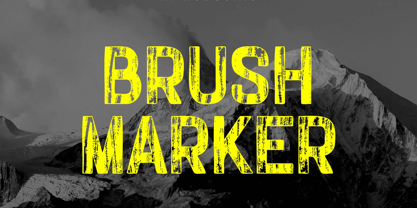 Introducing our new product the name Brush Marker Hand Painted Font. Modern Display font that is beautiful classy, elegant, and modern. This font is perfectly suited for a wide variety of projects, such as signature, stationery, logo, wedding, typography quotes, magazine or book covers, website headers, clothing, branding, packaging design, and more. Also for fashion-related branding or editorial design and displays both masculine and feminine qualities.
 - Okiku by Hanoded,
$15.00 The tale of Okiku Of The Nine Plates is an old Japanese story full of lust, deceit, murder and revenge. It tells of Okiku, a beautiful servant whose master lusts after her. After she refuses his amorous advances, he accuses her of stealing a costly plate and has her thrown down a well, where she dies. She then turns into an Onryō (a vengeful spirit). Okiku font is a thin, all caps, scratched typeface. Upper and lower case differ and can be interchanged. Okiku comes with an afterlife of diacritics.
 - Plener by LetterPalette,
$20.00 Plener is a type family of layered fonts available in four weights: Light, Regular, Bold, and Heavy. The properties of layered fonts are matched with the classical type family structure, which makes Plener specific. The letters have humanist origins, interpreted expressively with short brush strokes separated in layers. These humanist forms keep the text set in Plein Air surprisingly legible. Layer structure allows the user to play with colors and transparency, giving the text a more personal feel. Plener comes in two additional styles, made of layers from the Light and Heavy weight. These new, display styles, named Plener LLH and Plener LHH are separated from the main family. To make the work easier, we created basic fonts out of merged layers (for every weight and style). We recommend users to set the text using these basic fonts first, then apply an opacity value lower than 100%. When satisfied, copy the text on multiple layers, changing the font to Layer A, B, and C. Apply a unique color to the text on each layer or use the same color but different opacity value. Plener fonts have the following features: ligatures, oldstyle figures, proportional and tabular lining figures, fractions, etc. Besides, there are fifteen dingbats set as discretionary ligatures. Contains Latin and Cyrillic. For some extra tips on how to work with the Plener family, see the pdf file attached to the gallery.
 - Eskapade by TypeTogether,
$53.50 The Eskapade font family is the result of Alisa Nowak’s research into Roman and German blackletter forms, mainly Fraktur letters. The idea was to adapt these broken forms into a contemporary family instead of creating a faithful revival of a historical typeface. On one hand, the ten normal Eskapade styles are conceived for continuous text in books and magazines with good legibility in smaller sizes. On the other hand, the six angled Eskapade Fraktur styles capture the reader’s attention in headlines with its mixture of round and straight forms as seen in ‘e’, ‘g’, and ‘o’. Eskapade works exceptionally well for branding, logotypes, and visual identities, for editorials like magazines, fanzines, or posters, and for packaging. Eskapade roman adopts a humanist structure, but is more condensed than other oldstyle serifs. The reason behind this stems from the goal of closely resembling the Fraktur style to create harmony in mixed text settings. Legibility is enhanced by its low contrast between thick and thin strokes and its tall x-height. Eskapade offers an airy and light typographic colour with its smooth design. Eskapade italic is based on the Cancellaresca script and shows some particularities in its condensed and round forms. This structure also provided the base for Eskapade Fraktur italic. Eskapade Fraktur is more contrasted and slightly bolder than the usual darkness of a regular weight. The innovative Eskapade Fraktur italic, equally based on the Cancellaresca script previously mentioned, is secondarily influenced by the Sütterlin forms — an unique script practiced in Germany in the vanishingly short period between 1915 and 1941. The new ornaments are also hybrid Sütterlin forms to fit with the smooth roman styles. Although there are many Fraktur-style typefaces available today, they usually lack italics, and their italics are usually slanted uprights rather than proper italics. This motivated extensive experimentation with the italic Fraktur shapes and resulted in Eskapade Fraktur’s unusual and interesting solutions. In addition to standard capitals, it offers a second set of more decorative capitals with double-stroke lines to intensify creative application and encourage experimental use. The Thin and Black Fraktur styles are meant for display sizes (headlines, posters, branding, and signage). A typeface with this much tension needs to keep a good harmony between strokes and counters, so Eskapade Black has amplified inktraps and a more dynamic structure seen in the contrast between straight and round forms. These qualities make the family bolder and more enticing, especially with the included uppercase alternates. The Fraktur’s black weights are strident, refusing to let the white of the paper win the tug-of-war. It also won’t give away its secrets: Is it modern or historic, edgy or amicable, beguiling ornamentation or brutish presentation? That all depends on how the radically expanded Eskapade family is used, but its 16 fonts certainly aren’t tame.
 - Bemicy by Product Type,
$17.00 Say hello to Bemicy, a display font that combines handwritten touches with scribbled elements. This font comes with uniqueness and wit, bringing an experimental feel to each character. Each letter in Bemicy exudes a touch of scribbled handwriting, creating a stunningly experimental feel. Bemicy brings artistic uniqueness to your projects, giving them a look that is full of character and distinction. Bemicy is a great choice for projects that require an experimental, scribbled hand feel. Whether you're designing promotional materials, posters, or other works of art, these fonts provide an unforgettable personal touch. Get the Bemicy Display Font now and bring artistic distinction to every character.
 - Brillig by Scholtz Fonts,
$19.00 Brillig is a loose and informal handwriting font. It comes in four flavors, each of which has a very different feel. Brillig Gimble: more formal in that the characters are interconnected as in cursive script. To further enhance this effect, the characters have been created with a slightly "blobby" pen which provides a suggestion of precision. Brillig Earth: is bold and strong. It is more "down-to-earth" than the other styles, however, the boldness is tempered with quite wispy ends (terminuses) to the characters. It conveys a suggestion of speed and strength. Brillig Aire: is the most delicate and ethereal of the styles. Think of fairies, dandelions and dragonflies and you have an idea of what Brillig Aire conveys. Not only are the characters very light in weight, but they terminate in a wispy, delicate end. In spite of all this, Brillig Aire is very readable and can be used in a variety of contexts. Brillig Brave: is quite like Gimble in its feel with one important difference -- the characters are not connected as in cursive script. Each character stands alone. Brillig Line: is a clean, lightweight style using a mono width line for an informal, handwritten feel. There is a collection of the above four styles that is attractively priced and gives you the ability to use these four fonts in a variety of ways within the same document. The font is particularly useable for the promotion of products aimed at designers of: wedding invitations, party invitations, young clothing ranges, magazines, cosmetic packaging. It has been carefully letterspaced and kerned. All upper and lower case characters, punctuation, numerals and accented characters are present.
 - ZT Vollun by Khaiuns,
$29.00 ZT Vollun is a work of awakening from my valley of boredom in making fonts, it is not only a transformation of thickness, but also in terms of theme, aura, shape and beauty. Maybe this is a superstition of adulthood and also as we get older, our taste in cigarettes can change too. And the taste of the coffee is also getting bitter, in fact there is no sugar anymore, but the enjoyment is increasing. ZT Vollun consists of seven weights, starting from the thin one with curves combined with thin strokes, offering a playful aura, to the thickest one with a firm design that will present a thick modern atmosphere. Whether you're working on a branding project, an editorial project, or any other graphic project, ZT Vollun is the perfect choice for a modern, elegant look or any design vibe you can get your hands on. I hope you have fun using ZT Vollun. Thanks for using this font
 - VVDS Ginsburg by Vintage Voyage Design Supply,
$10.00 Ginsburg it's a modern display all-caps font-family based on geometric forms and abstract wavy lines with an old school constructivism look. Inspired by Moses Ginsburg architecture projects. Playful, modern, suitable for many typography projects as headers, logos, block texts, etc. You may be more strict in your typography or you may be more groovy or playful with alternates characters. Use this family in vintage spirit for TV series, Podcasts titles, exhibition posters or design a modern extreme sport brochure, . Flexible, Catchy and Brazen — it's all about Ginsburg! Six widths: Thin / Light / Normal / Medium / Semi Bold / Bold. Opentype Features as Stylistic alternates, Oldstyle figures / Fractions. Multilingual
 - Shizzle by 38-lineart,
$15.00 Shizzle is a font with a graffiti marker style. The lettterform of ‘Shizzle’ essentially made by the combination of downward and upward stroke base on -15 degres angle guideline. The basic of downward stroke is pulling pen from the top left to thw bottom right with full width of marker, then the basic shape of upward stroke look like the ligh flick by using the tip of the pen from bottom right to the top left. Inspired by Hip Hop and Rap style style. ‘Shizzle’ is a slang way of saying "Sure". People generally use it to communicate agreement to another person. This term is a product of Snoop Dogg's penchant for replacing the end of words with "izzle" to sound cooler. And ‘Fo Shizzle’ (for sure) this font offers beautiful typographic harmony for a diversity of design projects, including logos & branding, social media posts and advertisements, especially with graffiti look.
 - Lorjuk by Aisyah,
$12.00 Lorjuk is a handwritten font that features a natural and casual style. It has a personal and unique touch, with strokes that mimic the look of hand-written letters. This font is perfect for adding a personal touch to your designs, such as invitations, posters, or social media posts. The font is versatile and can be used for various projects, from informal to more formal ones.
 - ATHEWE by Twinletter,
$17.00 Athewe is a display font with a strong and courageous superhero theme. Created specifically for projects that require a bold, impressive impression, this font is the perfect solution for creating bold and bold designs. With Athewe, you can bring an awesome superhero feel to any of your projects. This font brings strength and boldness to your designs, creating a look that is both impressive and full of character. Each letter expresses a strong and daring style, delivering a memorable message to your audience. With features such as ligature and alternate, Athewe provides unlimited flexibility and creativity. You can combine these font elements to create unique and interesting variations of the style. In addition, multilingual support allows you to use Athewe in multiple languages, so your project can reach a global audience. If you’re looking for an alluring, powerful, and superhero-themed font, Athewe is the right choice. With a striking style and features that allow for creative experimentation, this font will catch the eye and inspire your potential customers. What’s Included : - File font - All glyphs Iso Latin 1 - Alternate, Ligature - Simple installations - We highly recommend using a program that supports OpenType features and Glyphs panels like many Adobe apps and Corel Draw so that you can see and access all Glyph variations. - PUA Encoded Characters – Fully accessible without additional design software. - Fonts include Multilingual support
 - Mirabel by Canada Type,
$24.95 Mirabel is based on the handwriting of Beverly Bouwsma (Philip's mother), which she developed in the 1930s in, as she puts it, an act of teenage rebellion. In the 1960s, Philip gave her a broad-edged Osmiroid fountain pen which she took to immediately and has used ever since, along with the computer fonts he made from her script. Since Beverly Bouwsma mixed loops and straight ascenders, two interchangeable fonts have emerged, a formal package that sacrifices some flamboyance for classical balance and legibility, but retains the quality of the writing and celebrates the personality of its creator. The Mirabel fonts are available in all popular font formats, and the character sets cover a wide range of codepages, including Central and Eastern European languages, Esperanto, Turkish, Baltic, Celtic/Welsh.
 - Museum Tertia Cursive by T4 Foundry,
$21.00Museum Tertia Cursive is inspired by a beautiful set of 126 matrices in the Swedish Norstedts type collection. These types were probably manufactured in Germany before 1750. The matrices are part of a set imported to Sweden by J.P. Lindh from Breitkopf & Härtel 1818. Now this exquisite design is available again, thanks to type designer Torbjörn Olsson. Please note modern additions like the ?-mark, @-sign and €-sign. Museum Tertia Cursive is an OpenType creation, for both PC and Mac. Swedish type foundry T4 premiere new fonts every month. Museum Tertia Cursive is our eighth introduction. Museum Tertia Cursive is part of the growing Museum type family. Museum also includes three different border fonts, an ornament font with some of Granjon's arabesques and a flowery Fournier font with Rococo capitals.